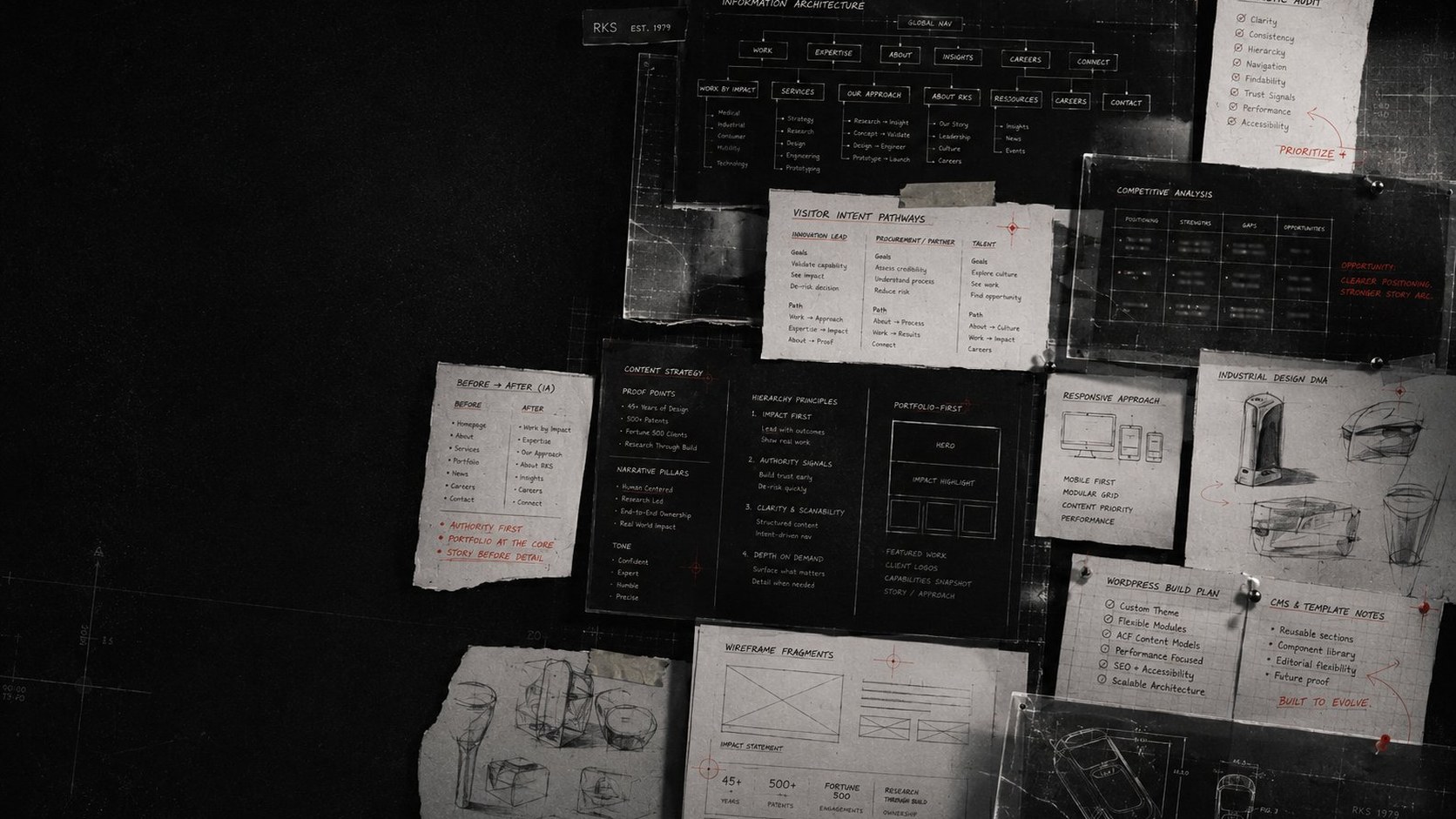
Authority, established before a word is read.
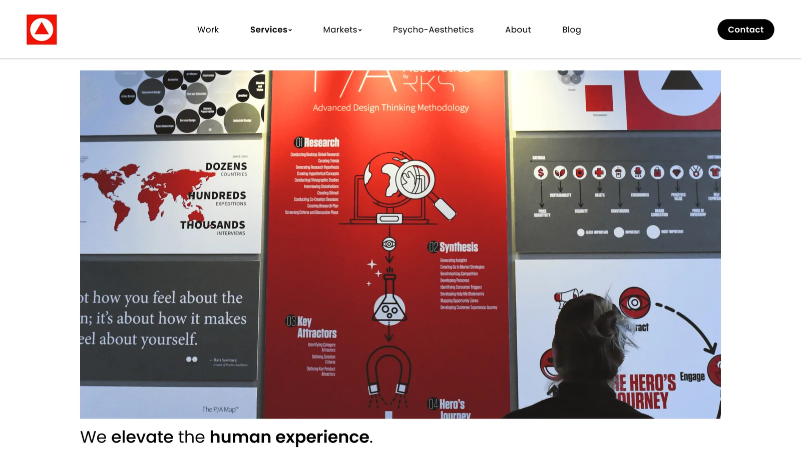
Full rebuild of the digital front door for a 45-year-old design consultancy whose portfolio includes 500+ patents and Fortune 500 engagements, owned end to end from research through build.
Outcome Shipped to production as a research-led IA pivot. The site now leads with proof of impact instead of internal department structure, and the WordPress build I delivered is maintained by the client’s team without me.
Numbers Available on a call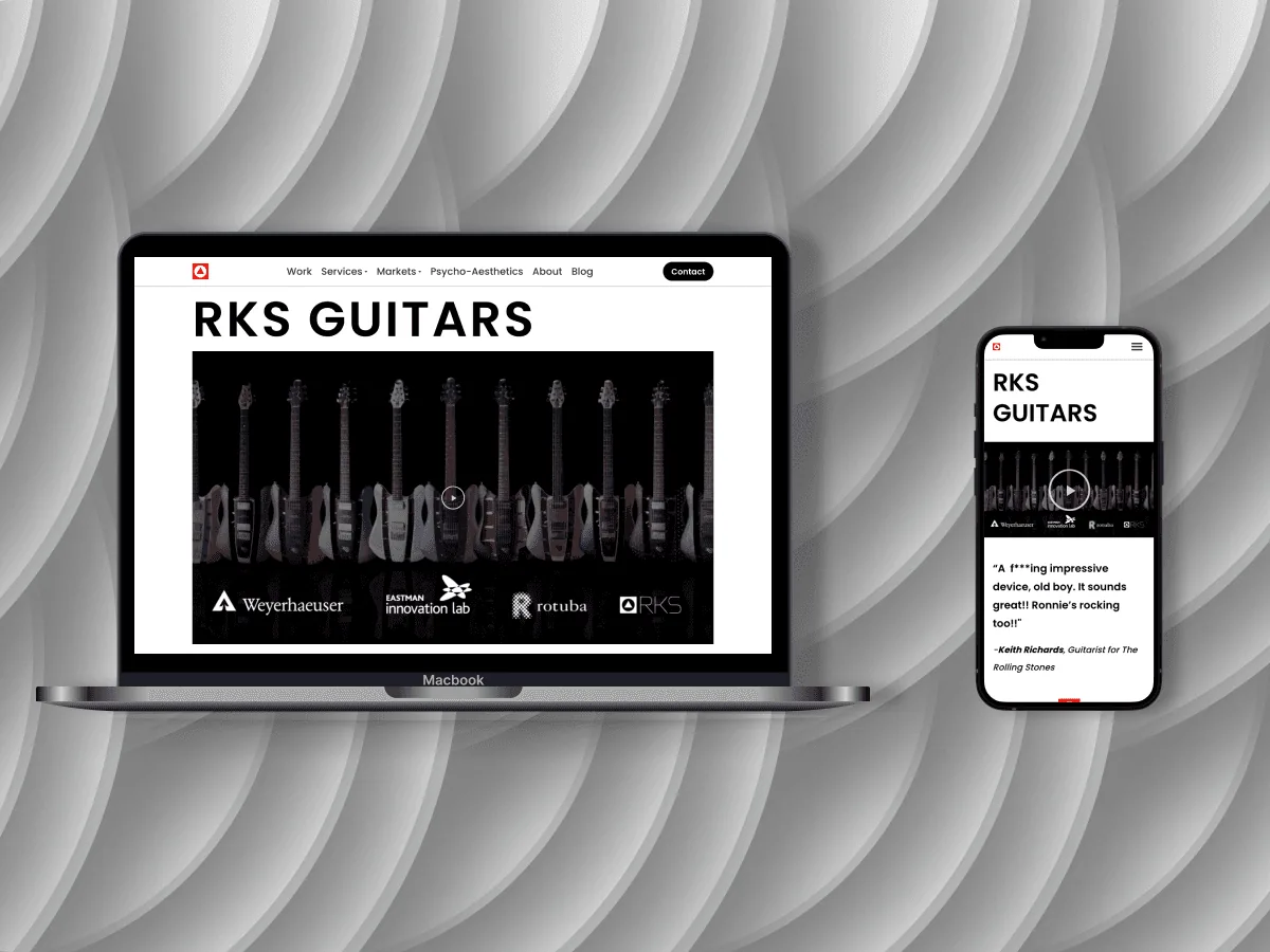
A globally recognised firm whose website told the wrong story.
RKS Design has been shaping products since 1980: forty-plus years of human-centred industrial design, a proprietary Psycho-Aesthetics® methodology, and a track record that has helped generate over 500 issued patents. Their client roster spans Fortune 500 giants and funded startups: Zebra Technologies, Hamilton Medical’s first-responder ventilators, BAE Systems’ infrared surveillance cameras, IGT’s casino-floor hardware.
The work was world-class. The website was not. The digital front door of a 45-year-old consultancy with products sold through Apple Stores read like a firm a fraction of its stature. Inconsistent hierarchy, buried work, a mobile experience adapted from desktop rather than designed. A prospective Fortune 500 client landing on that site had no way to see the calibre of the firm behind it.
The engagement was a full rebuild of that front door, owned end to end: research, information architecture, high-fidelity UI, and the production WordPress build. The brief, stated plainly: make the credibility visible at the URL, not explained three clicks deep on a services page.
A firm’s credibility has to be visible at the URL, not explained on the services page.
Before designing anything, I needed to understand why the site was failing.
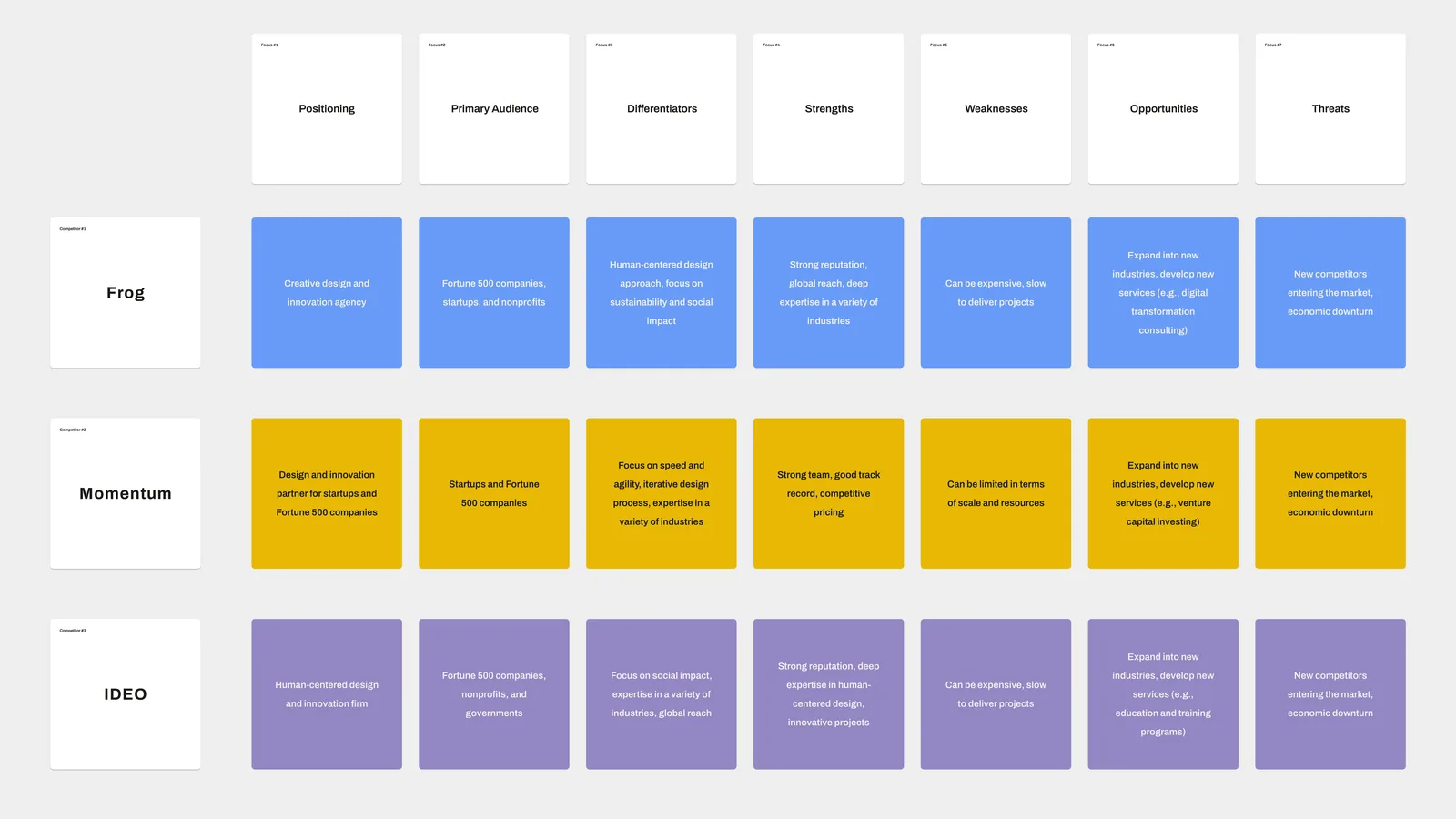
I started with a full heuristic audit of the existing site and a competitive analysis across peer design-firm websites, both before a single stakeholder interview. I wanted to walk into those conversations with a point of view: hypotheses to pressure-test, not a blank slate to fill.
The audit surfaced the predictable issues: inconsistent hierarchy, inaccessible contrast, a mobile experience clearly adapted from desktop rather than designed for the device. But the more useful finding was structural. The site was organised around how RKS thought about itself, not around what a visitor arrived to do. The competitive scan confirmed it: the firms that read as authoritative led with work and made the visitor’s path obvious; RKS led with internal structure and made the visitor hunt.
Stakeholder interviews then did something research is supposed to do and rarely gets credit for: they inverted the brief. I went in expecting a visual refresh. I came out knowing the problem was information architecture, and that a beautiful site on the existing structure would have failed for exactly the same reasons, just better-looking.
Reordering the site around visitor intent, not internal departments.
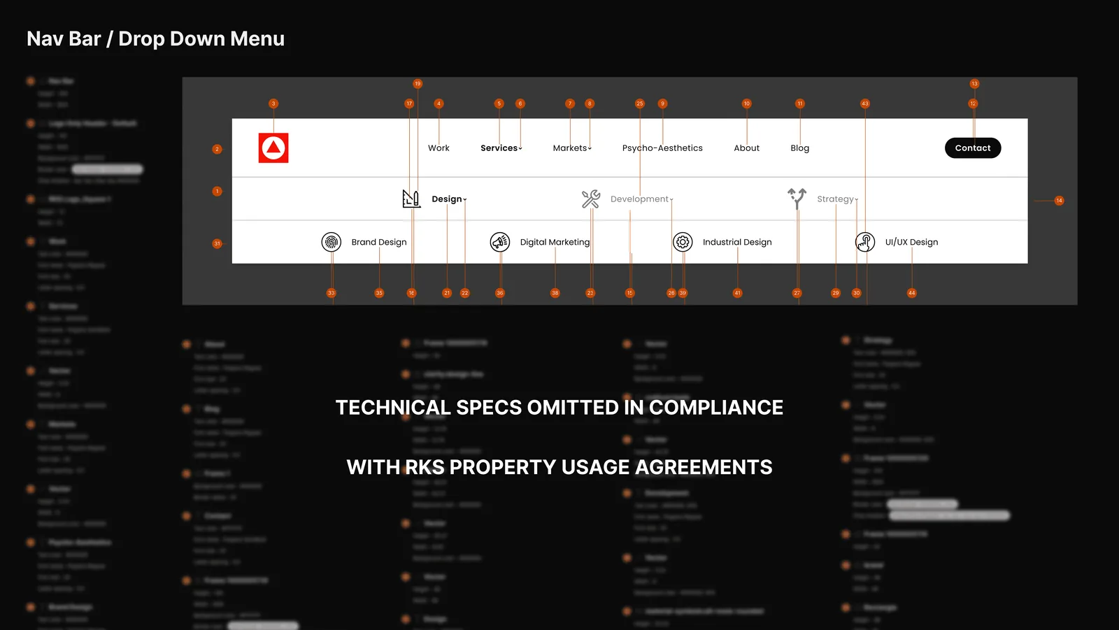
The existing navigation reflected how RKS was organised. “Methodology” was a top-level nav item, which made sense to the team internally and meant nothing to a prospective client scanning the site for the first time. Services were buried. Work was two clicks deep.
Drag to compare, or select a label to read that state in full.
Node labels condensed for the diagram; the structural inversion is the shipped one.
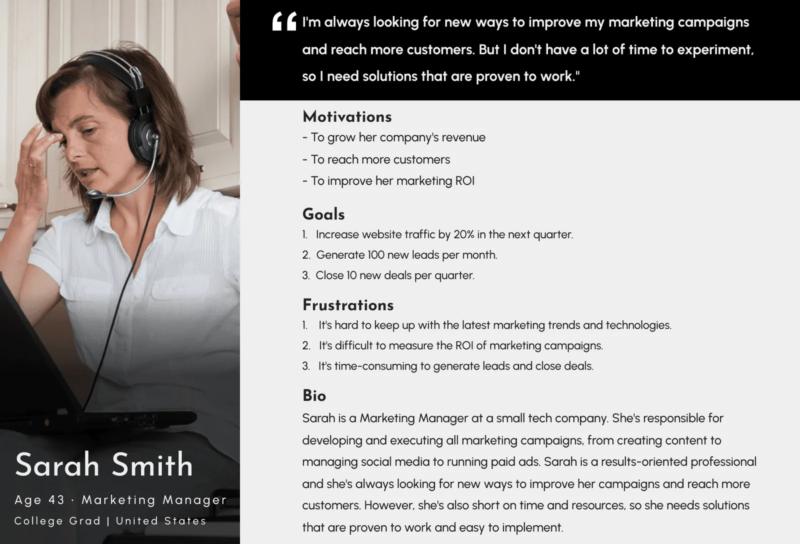
I restructured the information architecture around three primary pathways, one for each visitor type discovery had identified. The Fortune 500 client evaluating capability, the design-curious visitor looking for thinking, the potential hire assessing culture. Each got a clear path through the site. “Methodology,” a real strength of the firm, was repositioned as proof encountered along those paths rather than as a destination a visitor was expected to seek out.
I presented the new IA to leadership before any visual design began. Getting alignment on structure first, before a single screen was styled, is what kept the visual phase from becoming a debate about navigation. It also meant the hardest decision, deprioritising a nav item the firm was attached to, was made on the strength of the visitor evidence rather than in the middle of a design review.
A visual language that establishes authority before a word is read.
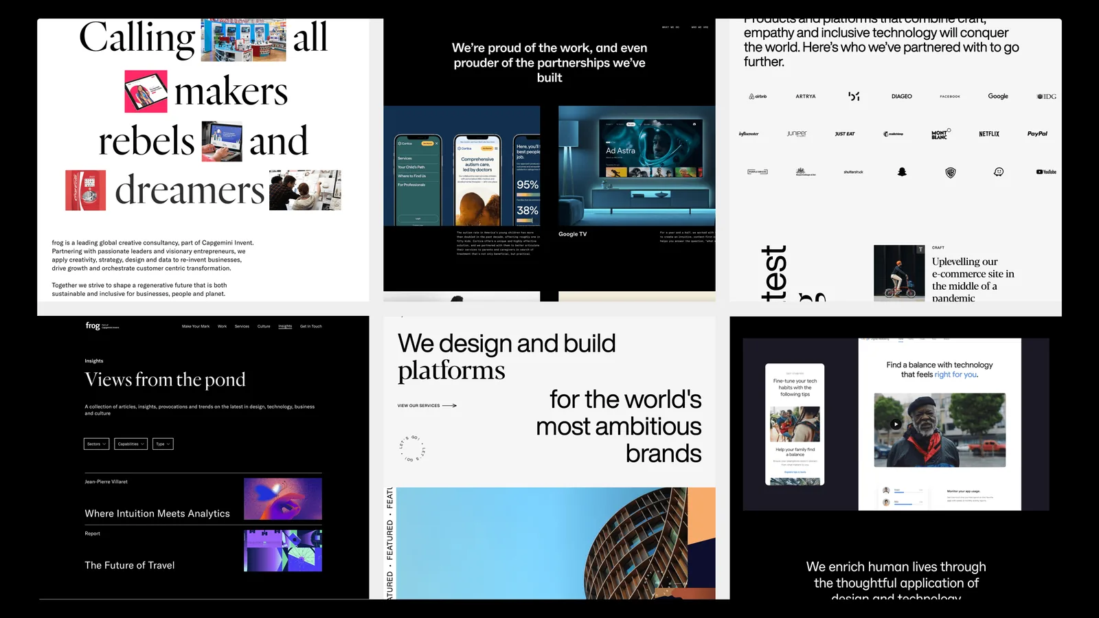
I developed multiple concept directions before presenting to RKS leadership. This wasn’t a formality; it was an exploration of what “a world-class design firm’s website” could be. One direction was editorial and magazine-influenced. One was minimal and Swiss. The one I ultimately advocated for committed to bold typographic scale and a portfolio-first hierarchy.
The typography decision was the most consequential one in the visual phase. Large, confident display type on the homepage communicates authority before the visitor has read a single word of copy, which is exactly the job the brief defined. A timid type system would have undercut the positioning no matter how strong the rest of the page was. The portfolio-first hierarchy did the rest: a visitor sees the calibre of the work before they see a description of it.
Built to be maintained, not just launched.
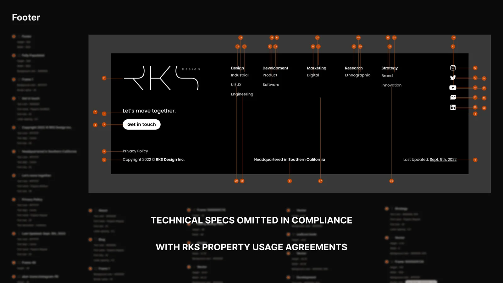
I built the full site in WordPress with Elementor, translating each high-fidelity design across desktop, tablet, and mobile. The known constraint with Elementor is that visual fidelity can drift during the build: a drag-and-drop builder makes improvisation easy and precision optional. I mitigated it the only way that reliably works: the Figma spec stayed the single source of truth throughout, and the build matched the spec rather than the builder’s defaults. Custom CSS handled the elements Elementor couldn’t express cleanly.
“Built to be maintained” was a real design requirement, not a slogan. The site shipped with a CMS template system the RKS team could operate independently (update work, publish thinking, manage content) without a developer in the loop. A handsome site the client cannot maintain decays within a year; the template work is what makes the rebuild durable.
What I’d do differently.
The mobile navigation took longer to get right than it should have. I designed it correctly in Figma, but the Elementor implementation introduced inconsistencies I caught late in QA, after a stakeholder review had already happened against slightly incorrect behaviour. I corrected it before launch, but the lesson was unambiguous: once development has started, stakeholder reviews should run on the live build, not on a Figma prototype.
I also underestimated how long the CMS template system would take to build properly. It was the right investment, and it is the reason the site is still maintainable. Next time I would scope it explicitly from the start rather than letting it expand unnoticed inside the build phase.
A presence that finally matches the work behind it.
The redesigned RKS website shipped fully responsive, WCAG-compliant, and with a CMS the team could operate independently. It surfaces 45 years of firm history, makes 500-plus patents discoverable, and reads, finally, at the calibre of the Fortune 500 work behind it.
The launch was phased, and that phasing is the part of this engagement I carry forward most. Each release was tested against real usage data before the next one went live, with the first data-driven refinement landing within 30 days of launch. Research corrects the design you haven’t shipped yet; post-launch data corrects the one you have. A rebuild that treats launch as the finish line never gets the second correction. This one was built to keep getting better after the team took it over.
A 45-year-old firm’s site shipped responsive, WCAG-compliant, and CMS-operable by the team. The first data-driven refinement landed inside 30 days, which is why I now treat launch as the first measurement, not the finish line.