Available · now
№ 01 · Selected work Independent venture

The booking problem is solved. The belonging problem isn’t.

NomadNest is a community-first travel platform I’m building as an independent venture — where the accommodation type becomes invisible and the experience of being somewhere becomes the product.

Where this is V1 product structure and experience language locked from the thesis; three core surfaces designed; pre-seed and pre-launch. The case argues on logic and category analysis, not on shipped metrics — by design.

Numbers Available on a call
RoleFounder · product & design
Period2025 — ongoing
ContextIndependent venture
StatusPre-launch · pre-seed
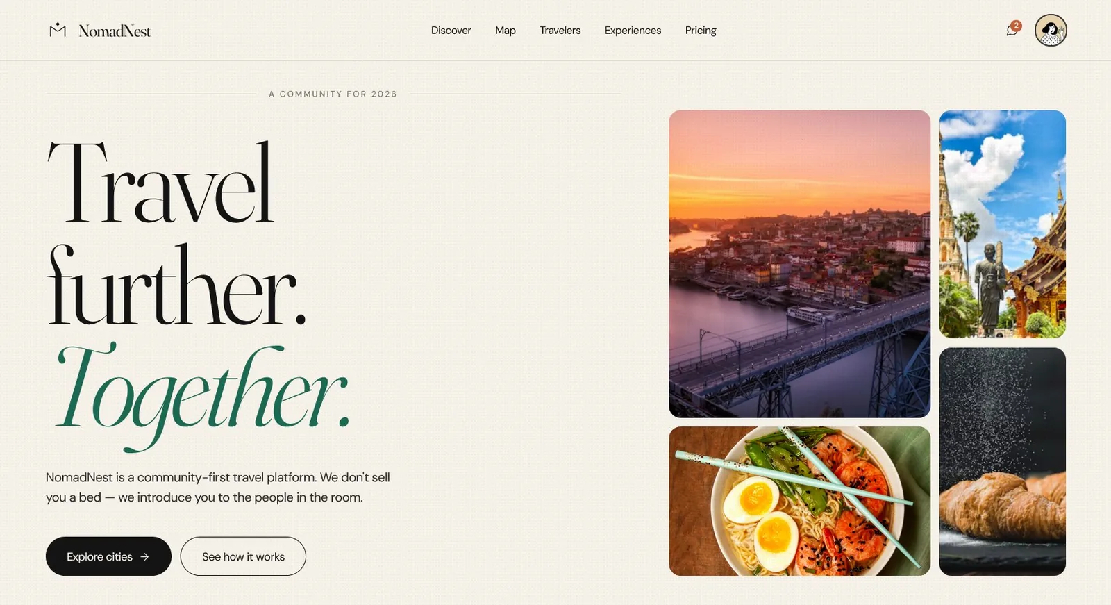
NomadNest community travel platform — the iOS prototype shown across multiple screens
The NomadNest iOS prototype — a community-first travel platform built from category positioning through interactive high-fidelity screens.

The premise.

Booking a trip has never been easier. Meeting someone once you’re there is still nearly impossible. The travel industry spent two decades optimising the transaction and never touched what happens after it — and that gap is where the next category winner gets built.

Hostelworld gets you a bed. Booking.com gets you a room. Neither gets you a community — and the travellers staying in hotels aren’t even in the building where the community happens. NomadNest is the platform I’m building to close that gap: community-first, where the accommodation type becomes invisible and the experience of being somewhere — at the same time as other people — becomes the product.

I’m developing this as an independent venture. Everything on this page — the category positioning, the research approach, the product framing, the interactive prototypes — is work I’ve done myself to take the concept from an idea to something I can hand to a co-founder, a first hire, or an investor. It’s pre-launch. It’s pre-funding. It is not pre-committed: the framing below is one I am ready to defend in detail.

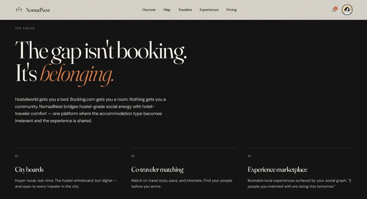
NomadNest brand thesis screen — belonging as the core product promise
Fig. 1 The thesis, stated plainly inside the product itself — belonging, not booking, as the experience the entire platform is organised around.

The travel industry optimised for booking and abandoned belonging. The next category winner closes that gap.

The category is crowded with the wrong competitors.

The online travel-accommodation market is one of the most mature consumer verticals on the internet. Booking.com, Expedia, Airbnb, Hostelworld, Agoda — every one of them has optimised the transaction to its limit. Not one of them has optimised what happens after the transaction, when the traveller is actually in the place they booked.

Hostels are the only accommodation type with any social scaffolding built in — the lobby, the shared kitchen, the bulletin board. Hotels have none of it and don’t pretend to. The result is a travel population split by accommodation price tier into two completely non-overlapping social experiences: travellers in hostels are meeting each other, and travellers in hotels are eating dinner alone.

That is the mis-framing the whole category inherits. Every incumbent treats accommodation type as a product boundary. It isn’t one — it’s a price boundary that the industry mistook for a product boundary, and then built two decades of software around. This is not a platform problem that hasn’t been solved. It is a platform problem that hasn’t been attempted, because seeing it at all requires ignoring the category lines every competitor draws.

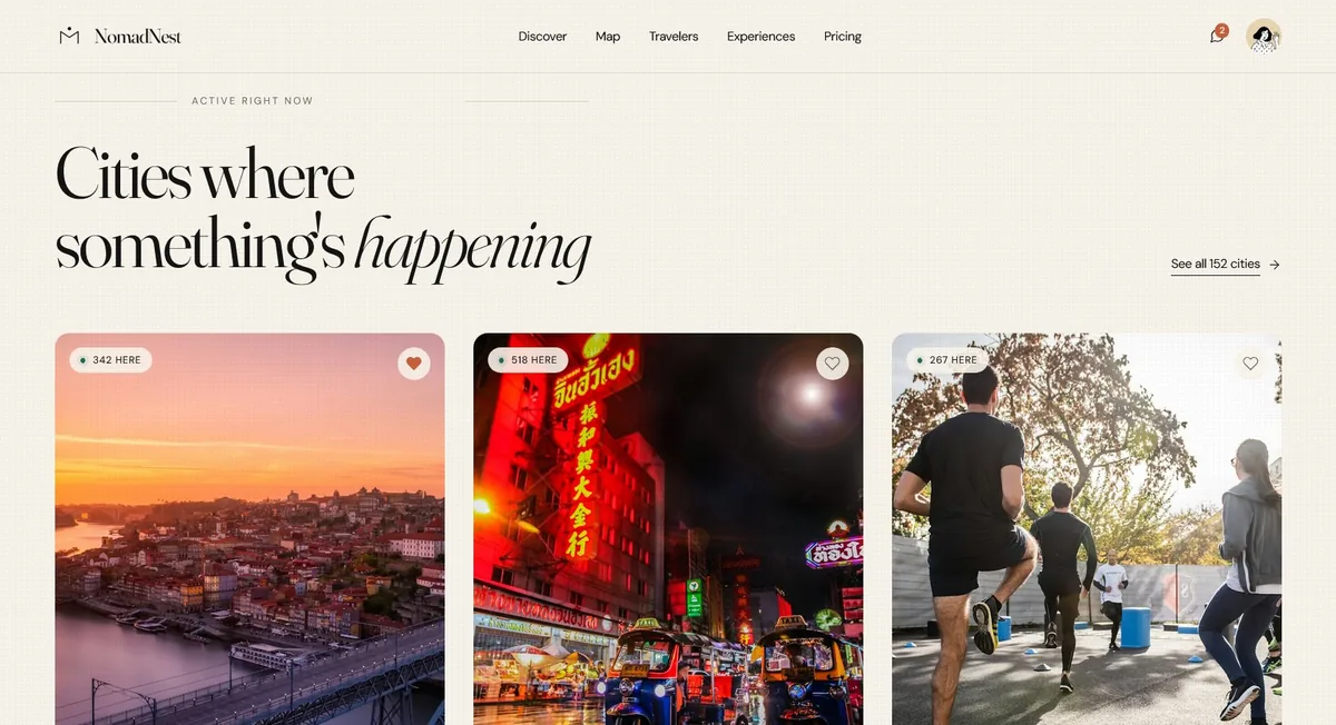
NomadNest Discover feed showing active cities with real-time traveler counts
Fig. 2 The Discover feed — active cities surfaced by who is there right now, not by destination marketing. The first screen a traveller sees is people, not places.

Pre-funding research, done honestly.

Pre-launch and pre-funding, I don’t yet have the budget to run primary research with recruited participants across three cities. The tempting move is to invent a few user-interview quotes so the page looks more rigorous. That would undermine the exact credibility I will need when I do raise and run the real study — so I didn’t.

What I did instead was triangulate: three research moves, each cheap enough to run alone, that together produce enough signal to design a credible V1 against. Competitive teardown, to map precisely where each incumbent stops. Ambient community signal — reading how travellers already self-organise in the channels they improvise, from hostel whiteboards to city-specific group chats. And archetype drafting: three traveller hypotheses specific enough to design for and specific enough to be proven wrong.

The primary user-research plan — recruitment screener, interview protocol, the framing it is built to validate or kill — is drafted and ready to run the moment funding clears it. Being explicit about what is signal and what is still hypothesis is not a weakness in the case. It is the operator discipline the case is meant to demonstrate.

The product isn’t the booking. The product is the room.

Before any visual design happened, one decision had to be made and committed to: where does the product’s centre of gravity sit? Three answers were on the table, and each one builds a different company.

If the centre of gravity sits at the booking, the product is a better Booking.com — and competes head on with companies that have a twenty-year head start on transaction optimisation. If it sits at discovery, the product is a better travel blog, and monetises like one. If it sits at the room — the metaphorical room, the actual space of being somewhere at the same time as other people — the product is something the category does not currently have, and cannot easily copy without unwinding its own core flow.

I committed to the third framing, and every subsequent decision cascades from it. The home screen isn’t destinations — it’s who is in which city right now. The unit of value isn’t a listing — it’s a board of people and what they’re doing tonight. Commerce is threaded through the community layer rather than extracted on top of it. A framing decision is only worth the name if it makes later decisions for you. This one does.

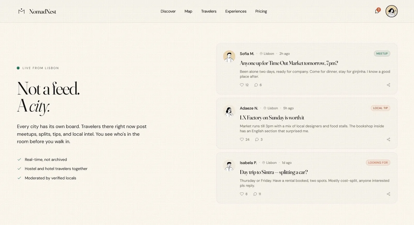
NomadNest Lisbon live board showing meetups, tips, and ride-splits forming in real time
Fig. 3 The Lisbon live board — the framing made literal. The primary surface is what travellers are doing right now: meetups forming tonight, local tips, ride-splits. Real-time and moderated, not archived.

Three core surfaces. Nothing else on the roadmap matters if these don’t land.

Category-defining products ship with a tight, opinionated V1 that forces the user to confront the new framing immediately. A fourth pillar in V1 would dilute the first three — so V1 is scoped to exactly three surfaces, each one the thesis enforced at a different altitude. Remove any one of them and what remains is a product already on the market.

City Boards

Hyper-local, real-time boards in every launch city: meetups forming tonight, cost-splits, tips, who’s here — moderated by verified locals. The hostel whiteboard, rebuilt for every city and every accommodation tier. Without this surface the product’s core promise fails completely, which is why it is V1 and not V2.

Co-Traveler Matching

Match on travel style, pace, and interests — not on star ratings or price tier. Travellers see compatible people in the cities they are about to visit and can connect before they arrive. This is the surface that turns a city board from a feed into a network.

Experiences Marketplace

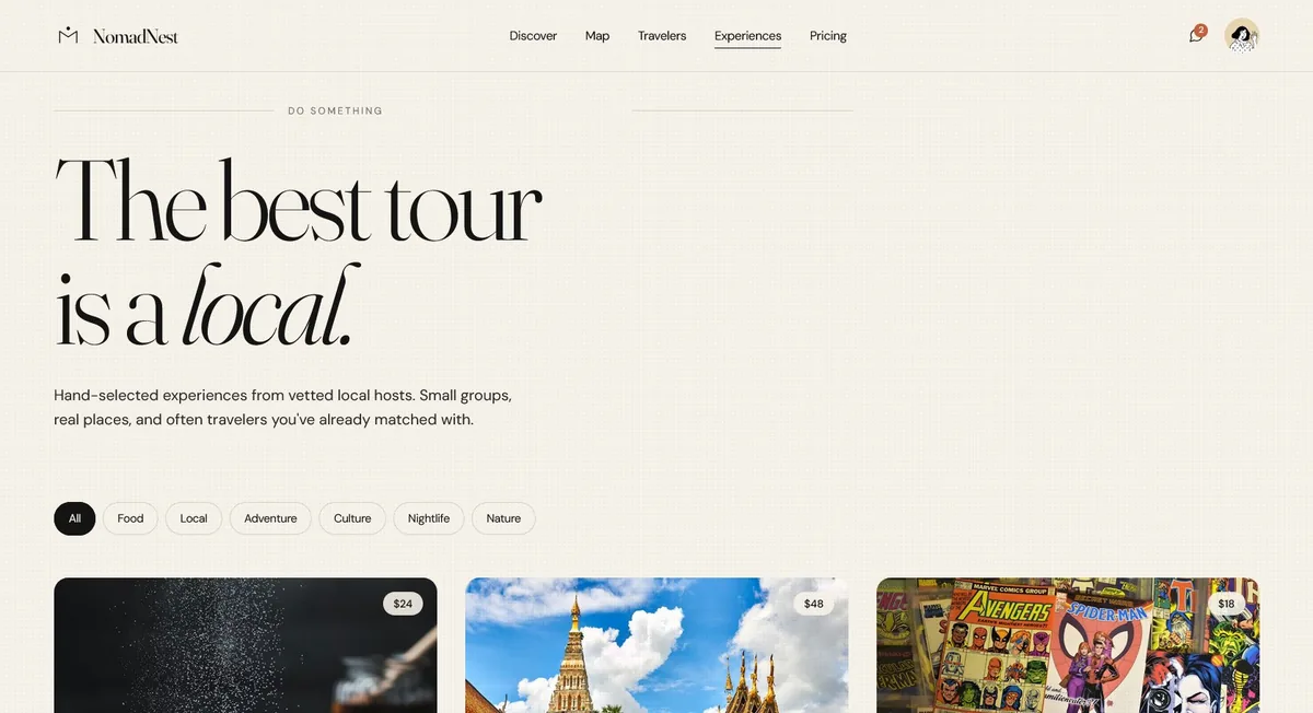
Bookable local experiences surfaced through the social graph rather than algorithmic ranking — commerce threaded through the community layer instead of extracted on top of it. It is how the platform earns revenue without breaking the framing that makes it worth using.

NomadNest Experiences marketplace surfacing locally-hosted tours through the social graph
Fig. 4 The Experiences marketplace — bookable local experiences surfaced by your social graph, not by algorithmic ranking. Revenue threaded through community, not extracted from it.

A web layout is a mood board. An interactive prototype is a commitment.

The iOS prototype is where the product moves from aesthetic to artifact. Not a static mockup — an interactive, single-file application that mounts a full 390×844 iPhone frame with working tab-bar navigation, modal sheet presentation, and typing-capable chat. Five tabs — Discover, Map, Messages, Experiences, Profile — push-navigated chat from the message list, and a city-detail sheet that slides up from any context in the app.

I built it specifically as the forcing function. A 390-pixel column does not allow for hero-section theatre. An iOS tab bar is five equal-weight bets on what the product actually is — every tab has to justify its place against four others with identical prominence. If the framing breaks under those constraints, it breaks everywhere, and better to learn that in a prototype than in a funded build.

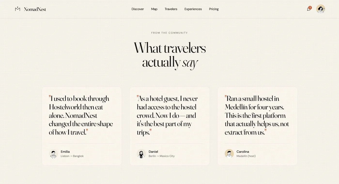
NomadNest community voice surface with verified first-person traveler narratives
Fig. 5 The community voice surface — verified, specific traveller narratives designed to replace generic review aggregation with first-person testimony that earns trust.

Where this actually is, right now.

This isn’t a case study — a case study has an outcome. This is the pre-outcome artifact, and being precise about that distinction is itself the founder skill the page is meant to demonstrate. What is held, and what is not, stated without hedging:

  • No live users yet. The product isn’t shipping. Primary user research starts the moment funding or a technical co-founder closes the gap.
  • No engineering build yet. The prototype is fidelity-complete HTML — enough to demo, not enough to operate.
  • No raised capital yet. Pre-seed conversations are active; the product being pitched is exactly what is on this page.

What is built and held: a defensible category position; a product framing I would pitch under pressure; fidelity-complete interactive prototypes that work across web and iOS; a drafted V1 scope tight enough to ship. And the discipline to state plainly what is proven and what is still hypothesis — which is the part of this page I would most want a hiring panel to read.

My roadmap — current capital, accelerated under funded capital.

Phase 01 · Now — Days 1–30, Concept Validation. Recruit 12–15 participants across the three archetype hypotheses; 45-minute moderated interviews. The deliverable: a validated or invalidated framing, stated plainly, before any further capital is spent on design. Running now, within the budget I have.

Phase 02 · Next — Days 31–60, Technical Partner. Close a technical co-founder or first engineering hire; convert the HTML prototype into a real build plan scoped to the three V1 surfaces only. The deliverable: a paired founding team and a concrete, dated build plan.

Phase 03 · Then — Days 61–90, Pre-Seed Close. Close a round against the V1 scope. Engineering starts day one. The transition from a pre-launch concept to an operating company.