
RKS Design —
Website Modernization
Elevating a world-class design firm’s digital presence to match its reputation — research-led, crafted end-to-end, and shipped.
The Brief
A globally recognized firm whose website told the wrong story.
RKS Design had spent decades doing exceptional work — human-centered product innovation across consumer, healthcare, enterprise, and government sectors. Their client roster included Fortune 100 companies. Their methodology was genuinely differentiated. None of it came through on their website.
As the sole UX/UI designer on the team, I was brought in to fix that. What started as a "refresh" became a full rebuild: research, IA, visual design, interaction design, CMS architecture, and front-end development — all owned end-to-end across a multi-sprint engagement.
The real challenge wasn’t aesthetic. It was strategic: how do you make a design firm’s website do what the firm itself claims to do for its clients?
Discovery
Before designing anything, I needed to understand why the site was failing.
I started with a full heuristic audit of the existing site and a competitor analysis across eight design firm websites before a single stakeholder interview. I wanted to walk into those conversations with a point of view — hypotheses to pressure-test, not a blank slate to fill.
The audit surfaced predictable issues: inconsistent hierarchy, inaccessible contrast, a mobile experience that had clearly been adapted from desktop rather than designed for it. But the more important finding was structural. The site was organized around RKS’s internal logic — how the firm thought about itself — rather than around the goals of the people arriving at it.
Stakeholder huddles with each department confirmed this and sharpened it. Every team had different priorities, and none of them had been reconciled into a coherent point of view about what the website should actually do.
- Prospective clients needed to assess expertise and find a clear path to contact — fast. They weren’t browsing; they were evaluating. Every extra click was friction in a purchase decision.
- Job seekers needed to understand the firm’s culture, working style, and people. That content existed but was buried under service-focused navigation built for clients.
- Current clients wanted fast access to specific service and market context. Scattered across inconsistent page types, it took longer than it should.
The competitive analysis showed that the best-performing design firm sites led with work and measurable impact — not service lists. RKS had exceptional case studies. They were impossible to find from the homepage. That single insight reordered every subsequent IA decision.

Competitive landscape analysis — eight design firm sites audited for navigation patterns, portfolio hierarchy, and conversion pathways
Strategy & Information Architecture
Reordering the site around visitor intent — not internal departments.
The existing navigation reflected how RKS was organized. “Methodology” was a top-level nav item — which made sense to the team internally but meant nothing to a prospective client scanning the site for the first time. Services were buried. Work was two clicks deep.
I restructured the IA around three primary pathways — one for each visitor type — and presented this to leadership before any visual work began. Getting alignment on the diagnosis first was deliberate. Once stakeholders agreed on the problem the navigation was solving, individual design decisions became much easier to defend.
Navigation labels were rewritten entirely. “Methodology” became contextually reachable but was no longer a primary nav item. Portfolio content moved to first-class status. Mobile navigation was rebuilt from scratch with thumb-zone ergonomics as the starting constraint, not an afterthought.
Deprioritizing “Methodology” as a nav item
RKS’s methodology is genuinely differentiated — it’s a real competitive advantage. The team was attached to its visibility. The research was clear: no prospective client used it as an entry point. The compromise: methodology content became richly integrated into case studies and the About page, where it landed with context rather than in isolation.
One CTA, not three
The original site had contact prompts scattered inconsistently. I consolidated to a single primary CTA per page, consistently positioned. Fewer options, clearer path.
Restructured sitemap — visitor-centric pathways replacing department-centric navigation
Visual Design
A visual language that establishes authority before a word is read.
I developed three distinct concept directions before presenting to RKS leadership. This wasn’t a formality — it was a genuine exploration of what “a world-class design firm’s website” could look like. One direction was editorial and magazine-influenced. One was minimal and Swiss. The chosen direction used bold typographic scale and portfolio-first hierarchy.
The typography decision was the most consequential. Large, confident display type on the homepage communicated authority instantly — something the previous site, with its modest heading sizes and dense copy blocks, completely failed to do. A design firm that uses small type to describe design services is contradicting itself.
The component system was built in Figma with tokenized spacing, a defined typographic scale, and a colour palette designed to recede behind client work rather than compete with it. Every component was annotated with hover states, focus management specs, and responsive behaviour before development began.
- Display typography at 2× the previous heading scale — authority established on landing
- Neutral palette that amplifies client imagery rather than competing with it
- Generous white space signalling premium positioning, not content avoidance
- WCAG AA contrast on every text element from day one — not retrofitted
- Motion used only to guide attention — no animation for its own sake
The editorial direction tested well aesthetically but felt editorially ambiguous — it risked reading as a publication rather than a consultancy. The Swiss minimal direction was clean but too cold for a firm whose entire positioning is around human-centered empathy. The chosen direction was the only one that felt like what RKS actually is.

High-fidelity homepage — bold typographic scale, portfolio-first hierarchy, consistent CTA placement
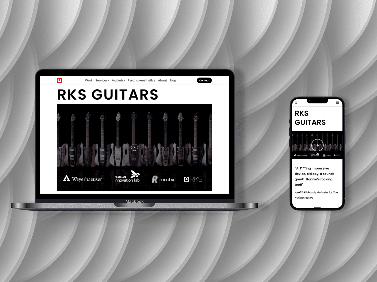
Work index and case study pages — portfolio elevated to first-class experience
Development & Launch
Built to be maintained — not just launched.
Every Figma frame translated to production, fidelity intact
Built the full site in WordPress with Elementor, translating each high-fidelity design across desktop, tablet, and mobile. The constraint with Elementor is that visual fidelity can drift in the build phase — I mitigated this by maintaining the Figma spec as the source of truth throughout, rather than improvising in the builder.
Custom CSS handled the elements Elementor’s drag-and-drop couldn’t reach: precise typography sizing, focus state management, and the micro-interactions documented in the spec.
The RKS team could publish new work without a developer
The CMS architecture was as important as the visual design. I built reusable Elementor templates for case studies, visual essays, blog posts, and service pages — with enough flexibility for varied content but enough structure to maintain visual consistency.
The goal was that a new case study should look like it belongs on the site without a designer touching it. That required opinionated templates, not blank canvases.
Core Web Vitals, cross-device QA, and SEO architecture
Multi-device and cross-browser QA before launch. Core Web Vitals benchmarking and image optimization to hit performance targets. Structural SEO implementation: schema markup, metadata, XML sitemap, and redirect mapping from old URLs.
Heatmap data drove three refinement cycles within 30 days
Hotjar heatmaps and session recordings went live on day one. Within the first 30 days, three clear patterns emerged: users were scrolling past the primary CTA on the Work page, the Services dropdown was generating unexpected hesitation, and mobile users were frequently navigating from the homepage directly to the About page — suggesting talent acquisition was a heavier use case than the nav hierarchy prioritized.
All three informed refinements that shipped in the first month. The CTA repositioning alone showed measurable improvement in click-through within two weeks.
Reflection
What I’d do differently.
The mobile navigation took longer to get right than it should have. I designed it correctly in Figma, but the Elementor implementation introduced some inconsistencies I caught late in QA — after a round of stakeholder review had already happened with slightly incorrect behaviour. I corrected it before launch, but the lesson was clear: stakeholder reviews should use the live build, not Figma prototypes, once development has started.
I also underestimated how long the CMS template system would take. What I scoped as two days of template work expanded to nearly a week once I committed to making them genuinely maintainable by non-technical editors. That was the right call, but it should have been scoped correctly from the start.
The post-launch analytics were the most valuable part of the engagement. Every heuristic assumption I brought into this project was tested by real usage data within 30 days — and some of it told a different story. That feedback loop is now something I build into every project from the start, not as an afterthought.
Outcome
A presence that finally matches the work behind it.
The redesigned RKS website shipped fully responsive, WCAG-compliant, and with a CMS the team could operate independently. The post-launch heatmap data confirmed the core IA hypothesis: portfolio-first navigation drove measurable improvements in time-on-page and CTA engagement within the first 30 days.
Let’s talk
Want to go deeper?
Happy to walk through the full process, the decisions that didn’t make the final cut, and the post-launch data that changed what I believed going in.