loop —
Social Platform Design
The social media problem isn’t that people don’t want to connect. It’s that the platforms make it easy to follow strangers and nearly impossible to meet neighbors. loop was built to close that gap.
The Premise
Geography as a feature, not a filter.
Engaged directly by loop’s founding team as their product designer, I owned the full design engagement end-to-end: research, information architecture, visual design, prototyping, and moderated usability testing through to developer handover.
The founding team’s hypothesis was precise: existing social platforms treat location as a tag you can search by. loop would treat it as the primary organizing principle. Your neighborhood wouldn’t be a filter you apply — it would be the default feed you open every morning. That distinction drove every design decision I made.
Note: this project has since been re-titled; the research and design work remains my own and is shared with permission.
Research
What I needed to understand — and what changed because of it.
I started with the assumption that geographic social features were underexplored. I wanted to test whether that was a design problem or a behavioral one — whether people didn’t use geographic features because they were hard to find, or because they didn’t actually want them.
Eight platforms were audited. User interviews were conducted across a range of ages and social confidence levels. The finding that surprised me most: almost everyone expressed a desire for local connection in the abstract. But when asked to describe a moment they’d felt that on an existing platform, most couldn’t. The want was real. The experience of it wasn’t.
The more important research output wasn’t the geographic insight — it was the confidence spectrum. Social willingness varied enormously across the people I interviewed. Any platform designed for extroverts would alienate the people who needed it most. The design had to work for someone who was nervous about putting themselves out there, not just someone who was comfortable doing it publicly.
- Private reply became non-negotiable. Multiple interviewees described replying publicly as a barrier to participation. Private reply wasn’t a nice-to-have — it was the feature that made the platform safe for the people who most needed it.
- Content quality filtering was reprioritized. Every interviewee mentioned signal-to-noise as a reason they’d stopped engaging with existing platforms. A local feed full of noise is worse than no local feed at all.
- The curated feed was added. The founding brief had two feed types. Research made clear that a third — interest-driven rather than geography-driven — was necessary to serve users who had interests that didn’t map to their immediate neighborhood.

Competitive landscape analysis — eight platforms audited for geographic feature depth, content discovery patterns, and social confidence requirements
User Personas
The design tension at the core of loop.
Three personas emerged — each representing a genuinely different relationship with social confidence and community. The design challenge wasn’t serving any one of them well. It was building a platform where all three could participate without one’s comfort coming at the expense of another’s.
High social intent, no existing anchor. She knows how to connect — she has no one to connect to yet. She needs a platform that works as an entry point, not a destination you need friends to unlock. Every discovery surface in the app was designed with Yolanda in mind first.
He wants connection but finds public social participation high-pressure. He’s the reason private reply exists. Without a low-stakes way to engage, he never participates at all — and his absence makes the platform worse for everyone else too. Matthew is the hardest user to design for and the most important one to get right.
She’s already deeply community-rooted. She’s not looking for a new social network — she’s looking for a better signal. The content quality filter was designed specifically for Christine: she’ll leave the platform if the noise-to-signal ratio isn’t solved, and she’ll recommend it to every parent she knows if it is.
Information Architecture
The hardest structural problem: three feeds with different logics in a single navigation.
The local feed, extended feed, and curated feed weren’t just three tabs — they each had fundamentally different content hierarchies, different discovery patterns, and different participation mechanics. The local feed needed to surface proximity and recency. The extended feed needed to surface activity and relationship. The curated feed needed to surface interest alignment.
The navigational challenge was making those three distinct experiences feel like one coherent product. The solution was a shared chrome with differentiated content logic — the same navigation, posting, and profile patterns regardless of which feed you were in, with the underlying content ranking and discovery completely different per context.
I developed user stories for each persona in each feed before any wireframing began. This produced 27 distinct scenarios that the IA needed to support. Several of them revealed contradictions that had to be resolved before a single frame was drawn.


Low and mid-fidelity wireframes — testing the shared navigation model across all three feed contexts before committing to visual direction
Visual Design
Warm enough to feel like community. Clear enough to function.
The visual direction was a deliberate reaction to the cold, metric-obsessed aesthetic of most social platforms. loop needed to feel approachable — but it couldn’t sacrifice clarity for warmth, because the information density of a local feed is real and the design had to handle it gracefully.
The typographic system used a friendly, humanist sans-serif for user-generated content and a more structured system font for chrome and UI elements — a distinction that helped users naturally separate content from interface without being explicitly taught to.
Color was used functionally: the local feed used cooler tones that evoked proximity and place; the curated feed used warmer tones that evoked personal interest. The difference was subtle enough not to feel prescriptive, but consistent enough to reinforce orientation across the three contexts.
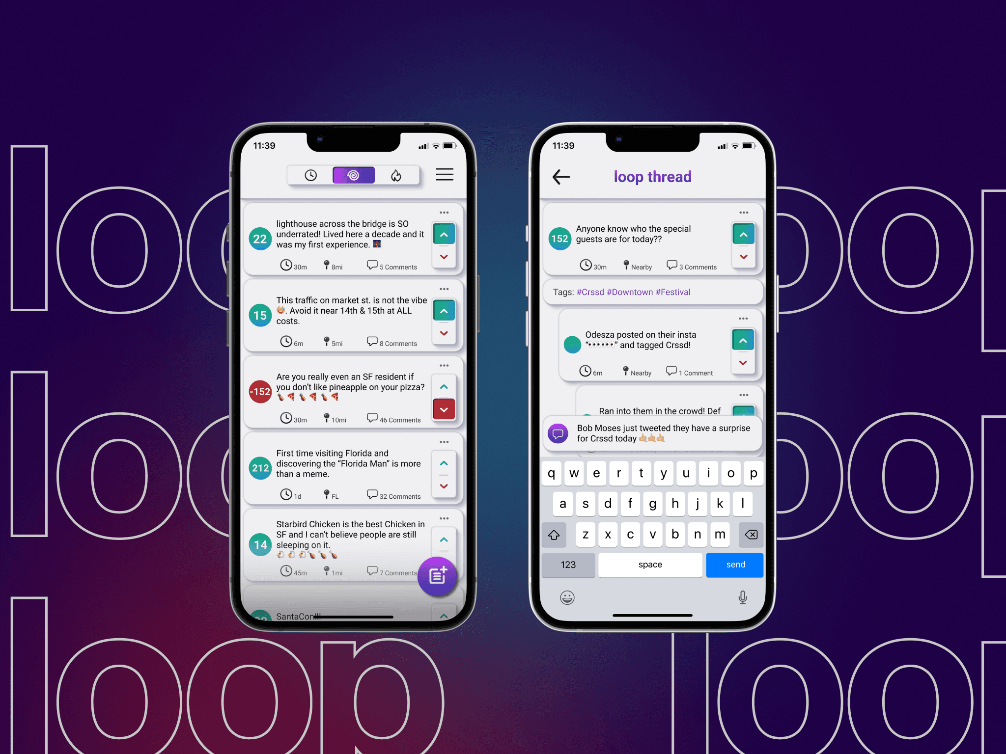
Private reply as a first-class affordance
The original brief treated private reply as a secondary feature — it was in the requirements, but not explicitly prioritized. After the research, I advocated for elevating it to a primary action on every post. This created a tension with the visual hierarchy I’d established for public interactions, and it took three iterations to resolve.
The content quality signal
Rather than building a complex algorithmic filter, I designed a simple quality signal system that rewarded genuine engagement (replies, saves, reshares with comment) over passive consumption (views, likes). The mechanism was invisible to most users but fundamental to how the local feed ranked content. Christine would only stay if the signal worked. This was how we made it work.

High-fidelity UI — local feed, navigation system, and post interaction design


Component library and screen detail views — the private reply affordance visible as a primary action
Usability Testing
What I was wrong about — and how the tests showed me.
Four moderated sessions, each using the same four user flows: finding content near the user’s location, searching local tags, creating a post, and replying privately. All participants used both laptop and iPhone prototypes while thinking aloud.
The search entry point was unclear in two of four sessions. Both participants completed the task, but they paused — one verbalized “I’m not sure where to start” before finding the search icon. That pause is the kind of friction that compounds in a real app. I moved the search entry point to a persistent tab and re-tested; both participants navigated directly on the first attempt.
The private reply affordance was missed in one session. The participant completed the flow when prompted, but didn’t discover it independently. My original treatment was visually minimal — I had prioritized the public reply to maintain hierarchy. The test told me I’d overcorrected. I added a secondary label on the action and repositioned it relative to the public reply. The final treatment was less clean than my original. It was correct.
- Local content discovery: 4/4 completed. Feed hierarchy and proximity signals read clearly across all participant types.
- Tag search & exploration: 4/4 completed post-iteration. 2/4 hesitated at initial search entry point — resolved by moving to persistent navigation.
- Post creation: 4/4 completed, no hesitation. The composer pattern followed established platform conventions intentionally — no reason to innovate where convention serves the user.
- Private reply: 4/4 completed. Iteration to affordance treatment was necessary for 1/4 to discover it independently.


Final tested screens — revised private reply affordance (right) versus original minimal treatment
Handover & Outcome
What shipped. What I’d do differently.
Post-iteration, a complete annotated handoff was produced: all screens across all states, the full component library, interaction documentation, and the design system. The project concluded on schedule with no design debt passed to engineering — every edge case was documented before handover, not flagged as a follow-up.
If I ran this engagement again, I’d test earlier and cheaper. I built high-fidelity prototypes before usability testing because the client wanted to see something polished. That’s a reasonable request, but it meant I was attached to decisions that hadn’t been validated. The private reply iteration was faster in the end — but a low-fidelity test would have caught it before I’d spent time on visual refinement I had to walk back.
The discipline of prototype-fidelity matching test-objectives is something I now scope explicitly at the start of every engagement. Test what you need to learn. Polish what you’ve validated.
Let’s talk
Want to see the full process?
Happy to walk through the research, the IA decisions, and the usability findings that changed what I shipped.