Hamilton Company —
UI & Design System
Reimagined.
Inheriting an approved direction and extending it into a system that could govern every interface in Hamilton’s ecosystem — 250+ frames, two themes, three platform types.
Context
Inheriting a direction. Owning the system.
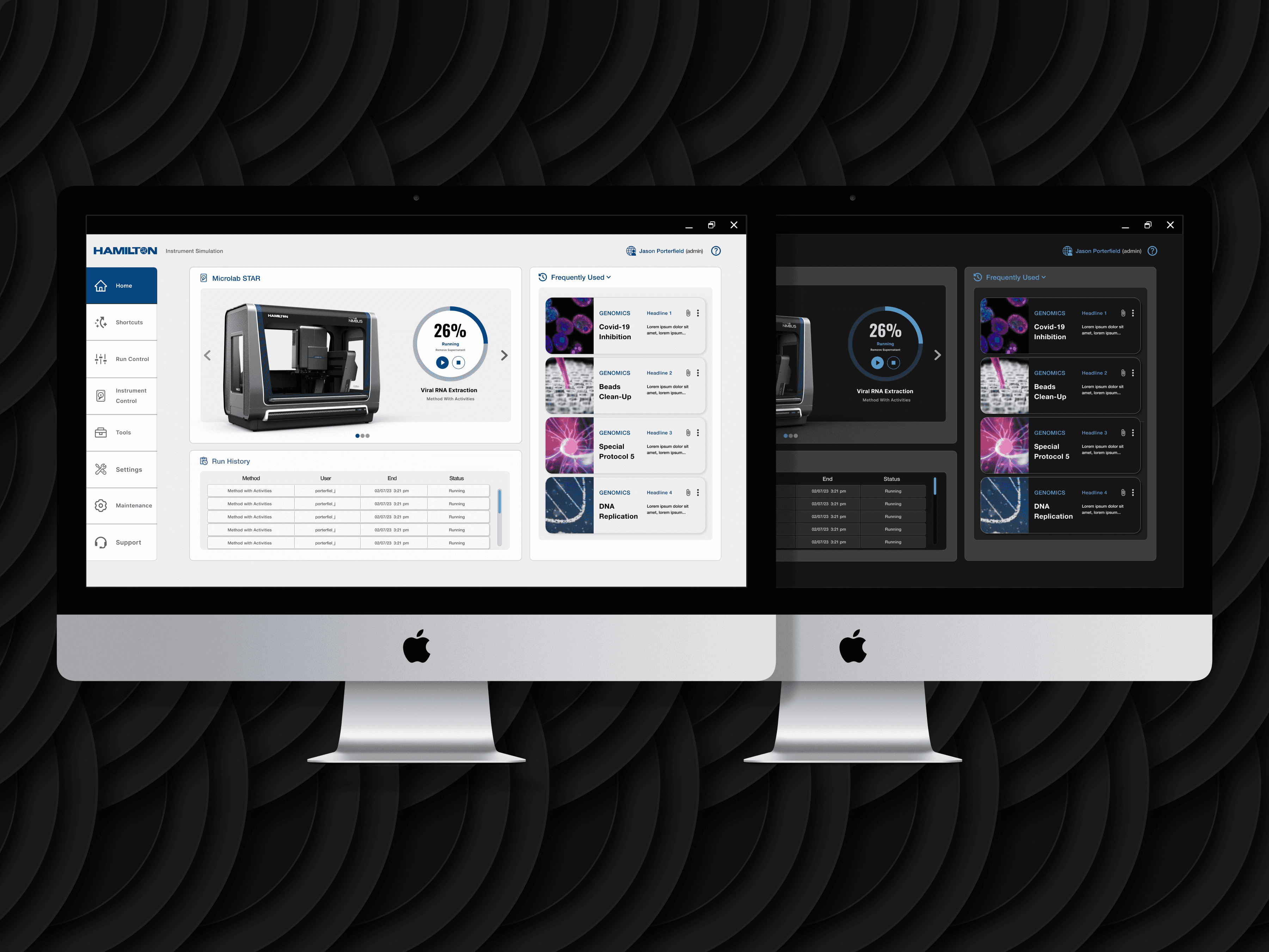
Hamilton Company makes precision liquid handling instruments used in laboratory environments worldwide. Their software ecosystem had grown organically over years — web apps, WPF desktop applications, and legacy embedded interfaces each operating under different visual conventions. The user experience of moving between them was jarring in a domain where precision and consistency are existential requirements.
RKS project management and Hamilton’s brand designer had already secured approval for an initial dashboard direction before I joined the engagement. My scope was clear and significant: take that approved starting point and build everything else — a complete design system, 250+ frames across 30+ page configurations, light and dark themes, and all the interaction patterns and component states the engineering team would need to build from.
Inheriting an approved direction is a specific kind of design challenge. You don’t start with a blank slate, but you also don’t have the context that shaped the original decisions. My first sprint was entirely about understanding the design language well enough to extend it coherently rather than impose my own sensibility over it.
The Design Challenge
One system for three fundamentally different contexts — without a single platform-specific exception.
This is what made the Hamilton engagement genuinely difficult: the system had to work across web, WPF, and legacy embedded interfaces without creating a different design language for each. Platform-specific exceptions in a design system are a slow-motion catastrophe — they compound over time and eventually fracture the consistency you were trying to create.
The additional constraint was input modality. Some of Hamilton’s interfaces are operated on touchscreen displays in laboratory environments — which means users might be wearing gloves. Touch targets that work for a 44px standard are inadequate when you’re wearing nitrile gloves and looking at a screen at arm’s length. The system had to accommodate that without making the desktop interfaces feel oversized.
Light and dark themes were a requirement, not a nice-to-have. Both needed to be equally polished — dark mode couldn’t be the default with light mode as an afterthought, which is the pattern most systems fall into.
- Platform agnostic — every component must render correctly on web, WPF, and embedded without modification
- Touch + mouse parity — tap targets sized for gloved hands; hover states that degrade gracefully on touch
- Theme symmetry — light and dark variants of equal quality, with WCAG AA contrast ratios verified on both
- Icon legibility at minimum size — icons used in dense data tables needed to remain recognizable at 16×16px
Design System Architecture
Building the foundation before the features.
Typographic scale, colour tokens, and spacing primitives
The first decision was the typographic scale. Hamilton’s existing interfaces used inconsistent sizing across platform types — headings in the web app bore no relationship to headings in the WPF application. I established a 6-step type scale (display, heading, body, body-small, caption, data-label) that could be mapped to platform-specific font stacks without losing its proportional relationships.
Colour tokens were built in pairs: a semantic layer (background, surface, border, text-primary, text-secondary, interactive, status) mapped to a platform layer below. This meant changing a brand colour was a one-token change rather than a search-and-replace across 250 frames.
Atoms before molecules: buttons, inputs, icons
Every primitive was designed with its full state set before any composite component was touched: default, hover, focus, active, disabled, loading, error. This isn’t interesting design work — it’s the work that makes the interesting design work possible. When an engineer asks “what does this button look like when it’s loading?” the answer should be in the file, not in an email chain.
The icon library was the most time-intensive primitive. I designed 40+ icons to a consistent visual grammar: 1.5px stroke weight, rounded caps, and a grid that held legibility at 16×16px in dense data tables. Each icon was delivered in three sizes with platform-specific sizing documentation.
Forms, data tables, navigation, and status systems
Hamilton’s interfaces are primarily data-dense: scientists using these tools need to see, sort, and act on large amounts of structured information quickly. The data table component became the most complex piece of the system: sortable columns, inline editing states, row selection, bulk actions, and empty states — all in both themes, all documented for engineering.
The navigation system required the most careful constraint management. Web, WPF, and embedded interfaces have fundamentally different navigation paradigms. The solution was a flexible navigation token that could express as a sidebar (web), a top-bar ribbon (WPF), or a simplified tab strip (embedded) — all drawing from the same semantic layer.
250+ frames — and the functionality that wasn’t in scope
By the time the component system was solid, the view-level design moved quickly. Each view was delivered in both themes, with all relevant states (loading, empty, error, populated with sparse data, populated with dense data). Thirty-plus page configurations covered the full scope of Hamilton’s platform surface area.
The most significant outcome of the sprint review process was scope expansion. During reviews, I would demonstrate how a given interaction pattern could be extended to handle a use case Hamilton hadn’t originally considered. Three new functional areas were approved and added to the handoff as a result — work that wasn’t in the original brief but emerged directly from close engagement with the product and the client’s actual needs.
Process Gallery
The system in production — across themes and platforms.


Primary dashboard — dark theme with full data density and action hierarchy established


Light theme variants — same components, equal visual polish across both modes


Form patterns and embedded interface layouts — same design language, different rendering context


WPF and status system views — the system at scale across different interface types
Collaboration & Handoff
The sprint process — and what changed because of it.
The sprint review cadence with Hamilton stakeholders and RKS engineering was structured to prevent the most common design system failure mode: building something theoretically coherent that engineers can’t actually implement without constant interpretation.
Every sprint review was run against a pre-agreed checklist: does this component translate cleanly to WPF? Are the touch targets documentable without custom engineering per platform? Is there a clear fallback for the embedded context? If the answer to any of these was no, we didn’t move forward — we solved it in the room.
This process occasionally required me to adapt a design decision I was confident in. There were two instances where a visual treatment that worked perfectly in the web context created WPF rendering constraints that would have required custom workarounds from engineering. Both times, I found solutions that preserved the visual intent without introducing technical debt. One of those solutions was actually cleaner than the original.
- 250+ frames across all views, themes, and states
- Annotated component specs with platform-specific implementation notes
- Icon library with size variants and usage guidelines
- Colour token documentation mapped to each platform’s rendering system
- Spacing and grid specifications aligned to 4pt grid
- Interaction documentation for all animated and stateful components
During a sprint review, I demonstrated a filtering pattern in the data table component that Hamilton hadn’t originally scoped. The client recognized immediately that it solved a workflow their users had been working around for years. That pattern became a feature request, was prioritized for the next engineering sprint, and ended up being one of three scope expansions approved through the review process.
Scope expansion on a design systems engagement is unusual. It happened here because the sprint process created genuine collaboration rather than sign-off theatre.
Reflection
What I learned building for a context I’d never designed in before.
WPF is a fundamentally different rendering environment than web. Gradients, shadows, and some CSS-equivalent visual effects that work trivially in a browser require significant engineering overhead in WPF. I learned this the hard way on the first sprint — a card component I’d designed with a subtle box shadow looked right and would have created meaningful engineering friction to implement on WPF.
The recalibration: I started designing with WPF constraints as a primary filter rather than a secondary check. The result was a system that was actually more visually disciplined — because constraints, when you respect them early, improve design rather than limiting it.
The other learning was about the difference between inheriting a direction and extending one. I came into this engagement thinking my job was to fill in the spaces the initial dashboard left. What I found was that extending a direction well requires understanding it deeply enough to make decisions the original designer would have endorsed — even for contexts they didn’t design for. That’s a different skill than starting from scratch, and one I’d underestimated before this project.
I’d scope the icon library more explicitly from the start. It grew organically as new interface requirements surfaced, which meant I revisited the visual grammar multiple times. A more deliberate upfront conversation about the full icon set — across all platform contexts — would have saved time and produced a more consistent first draft.
Outcome
A unified system. Three platforms. Zero exceptions.
The 250+ frame handoff was reviewed, approved, and moved into engineering across multiple sprint cycles. The design system shipped as a coherent whole — one visual language governing every interface in Hamilton’s ecosystem, with documentation thorough enough that the engineering team could implement without design consultation on individual component decisions.
Let’s talk
Want to go deeper?
Happy to walk through the system architecture, the sprint process, and the decisions that shaped how this came together.